the code
Capstone: Data Transformation in Python: the code
#STEP 1 LOAD AND ENRICH DATA
#1.1 import pandas and matplotlib
import pandas as pd
import matplotlib.pyplot as plt
#1.2 specify the file path
file_path = "/Users/macbook/Python/i2c.xlsx"
#1.3 Load the specific sheet directly into a DataFrame.
df = pd.read_excel(file_path, sheet_name='i2c.csv')
#1.4 Inspect the dataset for missing entries and understand its structure.
print(df.head()) #print dataframe first 5 rows
print(df.info()) #print dataframe columns and datatypes
print(df.isnull().sum()) #missing values in dataframe.
#No missing values were found in any column.
#1.5 Add the column unit price which equals price divided by quantity.
print(df.columns) #check if the column price and quantity exist.
df['unit_price'] = df['price'] / df['quantity'] #add column unit_price Here, pandas automatically calculates the value for each row and adds a new column to the DataFrame.
print(df.head()) #print the first rows
#1.6 Create the dictionary prices which for each product contains its price and the dictionary customers which for each customer contains a list of all order IDs associated to the customer.
prices = df.groupby('product_id')['unit_price'].mean().to_dict() #creates the dictionary prices
customers = df.groupby('customer_id')['order_id'].apply(list).to_dict() #creates customers dictionary
print("Prices Dictionary:", prices) #print prices dictionary
print("Customers Dictionary:", customers) #print customers dictionary
#1.7 Define the function get_ordertotal which takes an order ID as input and returns the total order value. If no matching order is found it should print “No such order.”.
def get_ordertotal(order_id): # Define the function get_ordertotal
total = df[df['order_id'] == order_id]['price'].sum() # Filter rows with the given order ID and calculate the total value
if total == 0: # Check if the total value is 0
print("No such order.")
return None
return total
#1.8 Create the DataFrame orders with the columns customer, orderid and ordertotal.
# Display the first few rows of the orders DataFrame
order_details = [] #Creates an empty list to store order details
print(order_details)
#1.9 Loop through the 'customers' dictionary
for customer, order_ids in customers.items():
for order_id in order_ids:
order_total = get_ordertotal(order_id)
if order_total is not None:
order_details.append({
    "customer": customer,
    "orderid": order_id,
    "ordertotal": order_total
})
#1.10 Create a DataFrame from the list of dictionaries
orders = pd.DataFrame(order_details)
#1.11 Display the resulting DataFrame
print(orders.head())
#1.12 Define the function print_order which takes an order ID as input and prints the order information.
def print_order(order_id):
order = df[df['order_id'] == order_id] # Filter the DataFrame for the given order ID
if order.empty:
    print("No such order.")
    return
# Print customer and order details
customer = order.iloc[0]
print(f"{customer['name']}n{customer['street']} {customer['street_no']}n")
print(f"Order No. {order_id}n")
print("ProducttQuantitytUnit PricetTotal Price")
for _, row in order.iterrows():
    print(f"{row['description']}t{row['quantity']}t{row['unit_price']}t{row['price']}")
print(f"nOrder Total: {order['price'].sum()}")
#STEP 2 VISUALIZE YOUR DATA
# 2.1 Prepare the data
df.rename(columns={'order_id': 'orderid', 'quantity': 'units', 'price': 'price'}, inplace=True)
df['date'] = pd.to_datetime(df['date'], errors='coerce')
df['month'] = df['date'].dt.to_period('M')
# 2.2 Group data
items_per_order = df.groupby('orderid')['units'].sum()
total_value_per_order = df.groupby('orderid')['price'].sum()
orders_per_month = df.groupby('month')['orderid'].nunique()
daily_revenue = df.groupby('date')['price'].sum()
weekly_orders_revenue = df.resample('W', on='date').agg({'orderid': 'nunique', 'price': 'sum'})
units_per_product = df.groupby('product_id')['units'].sum()
# 2.3 Define custom colors
custom_color = (90/255, 200/255, 190/255)
edge_color = (75/255, 160/255, 150/255)
#2.4 Individual visualizations
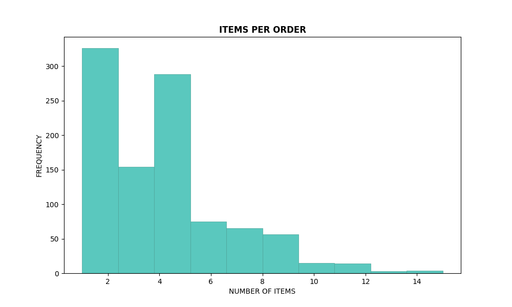
# Histogram for items per order
plt.figure(figsize=(10, 6))
plt.hist(items_per_order, bins=10, color=custom_color, edgecolor=edge_color, linewidth=0.5)
plt.title('ITEMS PER ORDER', fontweight='bold')
plt.xlabel('NUMBER OF ITEMS')
plt.ylabel('FREQUENCY')
plt.show()
# Histogram for total value per order
plt.figure(figsize=(10, 6))
plt.hist(total_value_per_order, bins=10, color=custom_color, edgecolor=edge_color, linewidth=0.5)
plt.title("TOTAL VALUE PER ORDER", fontweight='bold')
plt.xlabel('ORDER TOTAL VALUE')
plt.ylabel('FREQUENCY')
plt.show()
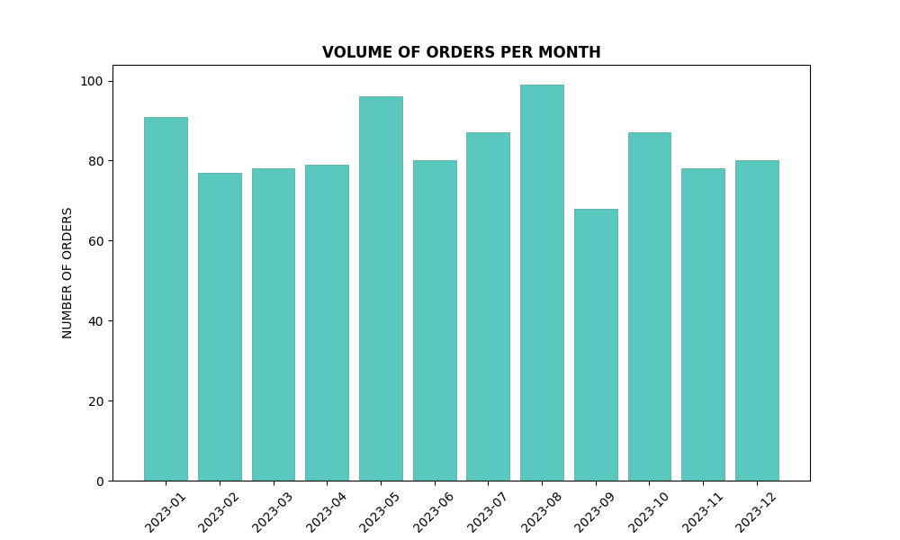
# Bar plot for orders per month
plt.figure(figsize=(10, 6))
plt.bar(orders_per_month.index.astype(str), orders_per_month, color=custom_color, edgecolor=edge_color, linewidth=0.5)
plt.title("VOLUME OF ORDERS PER MONTH", fontweight='bold')
plt.xlabel('MONTH')
plt.ylabel('NUMBER OF ORDERS')
plt.xticks(rotation=45)
plt.show()
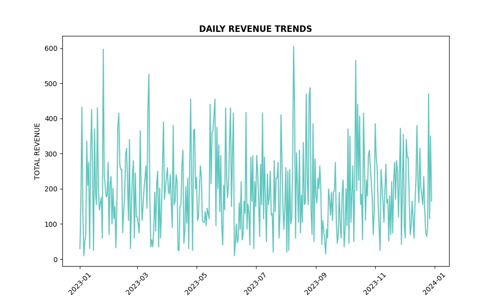
# Line plot for daily revenue
plt.figure(figsize=(10, 6))
plt.plot(daily_revenue.index, daily_revenue, color=custom_color)
plt.title("DAILY REVENUE TRENDS", fontweight='bold')
plt.xlabel('DATE')
plt.ylabel('TOTAL REVENUE')
plt.xticks(rotation=45)
plt.show()
# Scatter plot for weekly orders vs revenue
plt.figure(figsize=(10, 6))
plt.scatter(weekly_orders_revenue['orderid'], weekly_orders_revenue['price'], color=custom_color, edgecolor=edge_color)
plt.title("WEEKLY ORDERS VS REVENUE", fontweight='bold')
plt.xlabel('NUMBER OF ORDERS')
plt.ylabel('TOTAL REVENUE')
plt.show()
# Bar plot for total units sold per product
plt.figure(figsize=(10, 6))
plt.bar(units_per_product.index.astype(str), units_per_product, color=custom_color, edgecolor=edge_color, linewidth=0.5)
plt.title("TOTAL UNITS SOLD PER PRODUCT", fontweight='bold')
plt.xlabel('PRODUCT ID')
plt.ylabel('TOTAL UNITS SOLD')
plt.xticks(rotation=45)
plt.show()
#STEP 3 DATA MANIPULATION
#Address a real-world scenario where a customer cancels an order. Practice manually deleting and modifying rows to reflect this change accurately.
#3.1 Simulate order cancellation
cancel_order_id = 351278 # Example order ID to cancel
if cancel_order_id in df['orderid'].values:
df = df[df['orderid'] != cancel_order_id]
print(f"Order {cancel_order_id} has been successfully canceled.")
else:
    print("Order not found.")
#STEP 4 VISUALIZATIONS
#4.1 Craft visualizations that offer insights into the dataset, such as the popularity of products and the diversity of products per order.
# Bar plot for product popularity
product_popularity = df['product_id'].value_counts()
plt.figure(figsize=(10, 6))
plt.bar(product_popularity.index.astype(str), product_popularity, color=custom_color, edgecolor=edge_color, linewidth=0.5)
plt.title("PRODUCT POPULARITY", fontweight='bold')
plt.xlabel('PRODUCT ID')
plt.ylabel('NUMBER OF ORDERS')
plt.xticks(rotation=45)
plt.show()
#4.2 Bar plot for diversity of products per order
order_diversity = df.groupby('orderid')['product_id'].nunique()
plt.figure(figsize=(10, 6))
plt.hist(order_diversity, bins=10, color=custom_color, edgecolor=edge_color, linewidth=0.5)
plt.title("PRODUCT DIVERSITY PER ORDER", fontweight='bold')
plt.xlabel('NUMBER OF UNIQUE PRODUCTS')
plt.ylabel('FREQUENCY')
plt.show()
#STEP 5 OPTIONAL EXPLORATORY DATA ANALYSIS (EDA)
#5.1Go beyond the basics by exploring data relationships and patterns. For example, create visualizations showing orders and total order volumes by state, uncovering regional market trends.
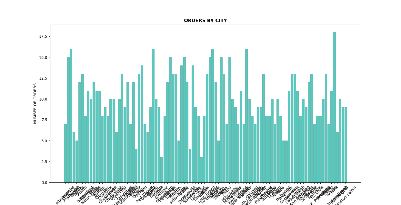
# 5.1 Bar plot for orders by city
orders_by_city = df.groupby('city')['orderid'].nunique()
plt.figure(figsize=(20, 7))
plt.bar(orders_by_city.index.astype(str), orders_by_city, color=custom_color, edgecolor=edge_color, linewidth=0.5)
plt.title("ORDERS BY CITY", fontweight='bold')
plt.xlabel('CITY', fontsize=7)
plt.ylabel('NUMBER OF ORDERS')
plt.xticks(rotation=45)
plt.show()
# 5.2 Bar plot for revenue by city
revenue_by_city = df.groupby('city')['price'].sum()
plt.figure(figsize=(20, 7))
plt.bar(revenue_by_city.index.astype(str), revenue_by_city, color=custom_color, edgecolor=edge_color, linewidth=0.5)
plt.title("TOTAL REVENUE BY CITY", fontweight='bold')
plt.xlabel('CITY', fontsize=7)
plt.ylabel('TOTAL REVENUE')
plt.xticks(rotation=45)
plt.show()